Agency 180 Undergoes Global Rebrand


The agency behind some of the most legendary pieces of modern advertising, such as adidas's 'Impossible is Nothing' and '+10' campaigns, SONY's 'make.believe', PlayStation's 'For the Players', UNICEF's 'Harry & Ahmed' and 'UNfairy Tales', Boost Mobile's 'Boost Your Voice' among many others, has recently turned 25 years old and viewed this milestone an opportunity to repackage itself for the next 25 years through a new internally developed brand identity and positioning, aimed to connect the business to what's next.
“Our name is deeply connected to how we think and act, and we wanted it to be portrayed in how we look too. It reflects our values, beliefs, and overall identity as a company. By ensuring that our name is reflected in how we present ourselves to the world, we are staying true to our core principles and maintaining authenticity in all we do," says Kika Douglas, CCO of 180 Amsterdam.
“...turn the problem halfway round. Don’t look for the secure solution. Don’t pull back from the passion.” – This part of a famous quote from Francis Ford Coppola inspired the agency's name and philosophy. With new creative leadership at the helm, 180 seized the opportunity to introspect and embody its core beliefs. This new era of creativity is celebrated through a refreshed visual identity, continuing the agency's legacy of award-winning work.
The in-house rebrand process began with a critical examination of the agency's positioning statement, "the world as it could be." The team deconstructed and rebuilt the positioning through a series of strategic steps, ultimately encapsulating it with three core principles: Radical Collaboration, Fresh Perspectives, and Fierce Empathy.
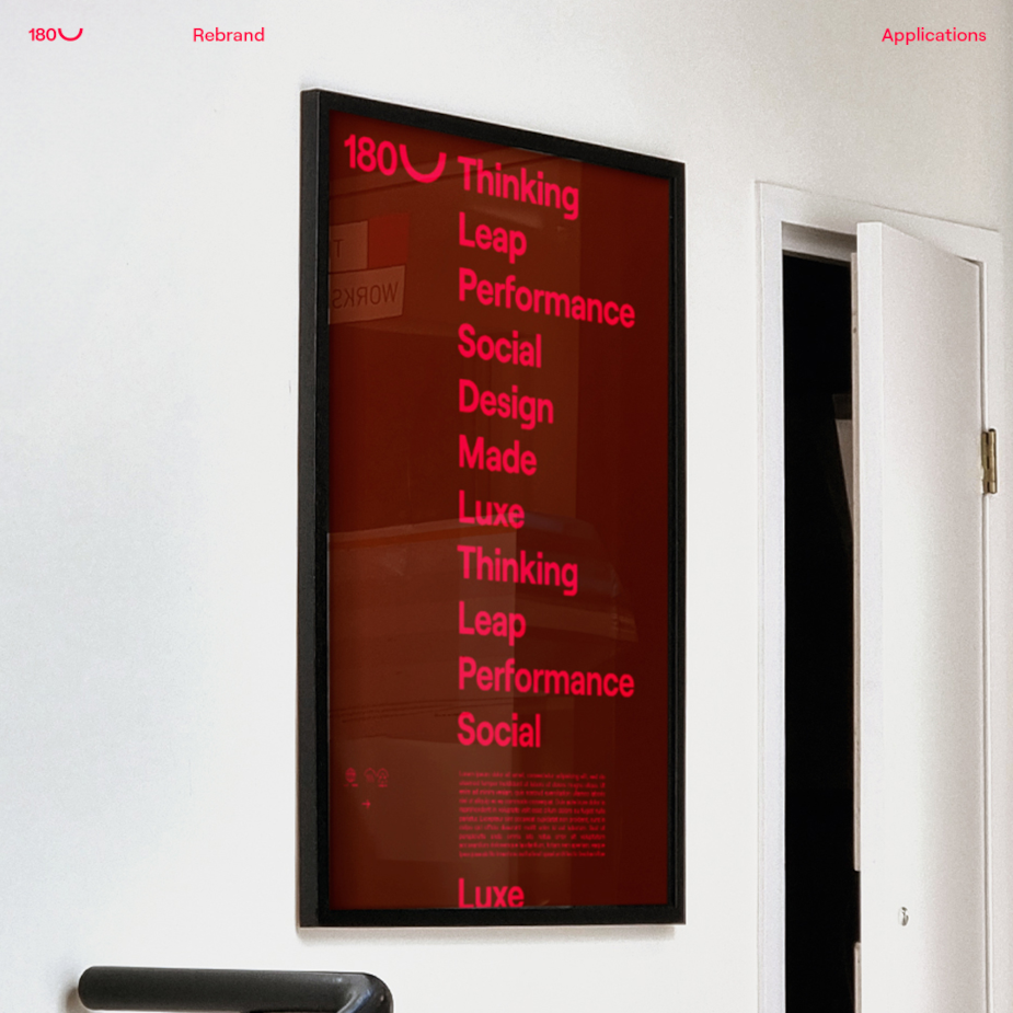
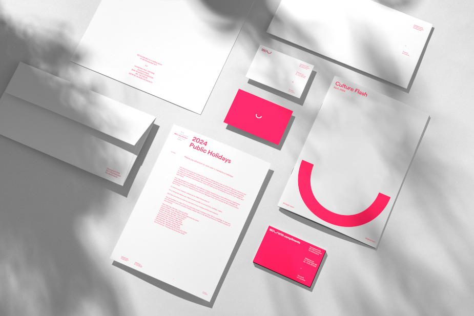
These principles are visually articulated in the new branding through the ‘180 Shift’, a graphic element integral to the agency’s identity:
- Radical Collaboration is depicted by the shape's role in linking 180 with its partners.
- Fresh Perspectives are conveyed through the movement of the 180 animation, symbolizing a new way of looking at things.
- Fierce Empathy is the foundation of the ‘180 Shift’, representing the creative connection between two entities.
Complementing the ‘180 Shift’, the new visual system includes a fresh colour palette, iconography, animations, and a redesigned website developed in collaboration with DarkBlue from London. The typeface Roobert, from Displaay Type Foundry, has been selected as the primary brand font, further defining the agency's aesthetic.
This comprehensive rebrand positions 180 to continue its innovative journey for the next 25 years, using the ‘180 Shift’ as a guiding framework to ensure consistency and creativity in future endeavours.

“Rebranding your place of work is a big, big task. We recognised it as a great opportunity to showcase some of 180's internal design capabilities. We embraced this challenge and developed something that can serve as a playground for new executions for whatever comes next.” said João Porto, sr. designer at 180.
“Our in-house design team had the incredible opportunity to work on the 180 rebrand. This project carried significant responsibility as the first change in 25 years. We crafted a bold, playful, and flexible visual identity to celebrate and translate our vision for the next 25!” said Farid Bawa, head of design at 180.