Chelsea FC Brings New Fire for 'We Burn Blue' Home Kit Launch


Chelsea FC teams up with creative studio Uncommon to bring new fire to one of the London club’s most anticipated seasons yet. Chelsea FC set Uncommon the brief to define a new brand narrative that captures the club’s iconic past, and brings Chelsea together under a shared ambition for the future. Coming to life in a new visual identity, today the world gets to see the first iteration from this creative partnership in the form of a campaign to launch the club’s new home kit.
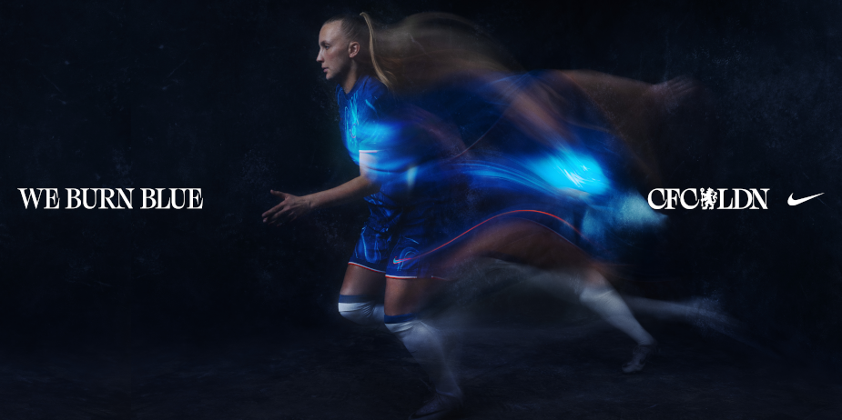
Chelsea FC and Nike are thrilled to unveil the latest home kit for the upcoming season, featuring a bold new design that has never been seen before on a Chelsea shirt. A new era under men’s and women’s team head coaches Enzo Maresca and Sonia Bompastor brings with it new energy, new passion, and a new fire.
The centrepiece of the new home shirt is the vibrant blue colour, symbolising the hottest part of a flame, and the burning passion and determination of the Chelsea players and fans to succeed on and off the pitch.
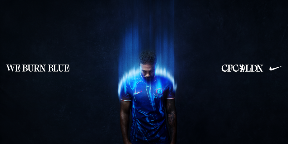
To bring this to life, Uncommon created a new campaign which includes film, photography, design, outdoor and social featuring Cole Palmer, Sam Kerr and Moises Ciacedo as well as some of Chelsea’s most exciting youth talent. The work uses a striking aesthetic throughout based on this potent blue flame paired with SFX and visual techniques to capture the energy, passion and determination that burns inside every Blue.
The campaign features a combination of stars from the Men’s and Women’s first teams, including a selection of the most exciting home grown talent in Alfie Gilchrist, Connor Gallagher, Reece James, Levi Colwill and Aggie Beever-Jones.
The launch film starts on what appears to be a flickering blue flame in the distance - as the momentum builds, we pause on a player’s eyeline - we see their unwavering intent on the season ahead.
As the track warps, figures flurry on screen, a player dons the new shirt - we then cut to a mesmerising shot of Chelsea’s iconic red rose smouldering in the darkness - signalling a new beginning for the club.
As the track drops the blue flame returns this time with more ferocity. Every player begins to burn blue as their passion for the game spreads like wildfire.
For the soundtrack, Uncommon worked with London-based producer and DJ, Joy Orbison, to create a bespoke edit of his seminal track Flight FM - the biggest underground track of the year.
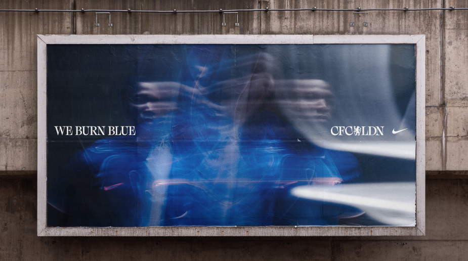
The new campaign also teases a new visual identity for the club designed by Uncommon. Throughout the film, outdoor and social assets we see ‘CFC LDN’ - a new icon that cements Chelsea as London’s true club.
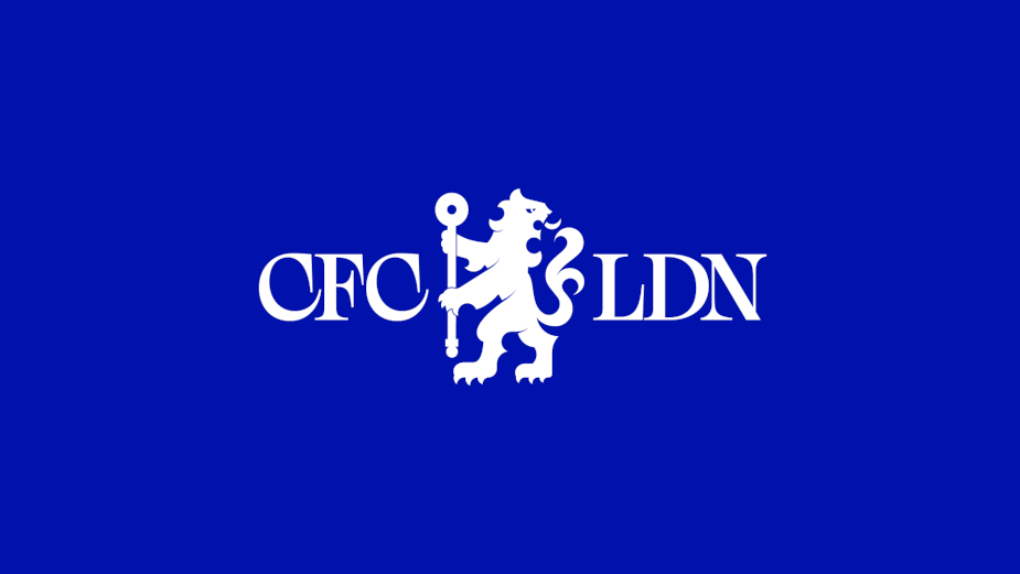
This new visual identity will continue to come to life across the club, stadium and players throughout the season. Stay tuned later this year.
The outdoor features a series of iconic visuals representing the energy burning within each player - using special effects and motion blur techniques the photography captures each player in the new kit burning blue. The outdoor campaign will run across London this month.
The stills photography and film was shot and directed by Thomas Van Kristen, a lifelong Chelsea fan whose work is fuelled by his love for sports and urban culture, produced by Common People Films with 2nd Unit photography captured by Charlie Birch, also represented by Common Image.
“This is the fans’ energy. The players’ energy. The city’s energy. We Burn Blue,” said Claire Cronin, chief marketing officer of Chelsea Football Club. “Our new home shirt embodies the passion, drive, and determination that runs through the veins of everyone associated with the club. It is a representation of our history, our present, and our future. We couldn’t have chosen a better partner in Uncommon to help us bring this important moment to bear.”
Nils Leonard, co-founder, Uncommon Creative Studio said, “This thinking encapsulates the club and players sentiment ahead of the new season, as they bring a new energy and new fire to Stamford Bridge. This is only just the beginning - this is about partnering with the fans, players and club to create the brand Chelsea has always deserved, to bring the iconic London club to the world.”
Adding a unique touch to the design, an orange accent colour represents a different kind of fire coming through the ranks at the club. Chelsea’s squad is a blend of exciting homegrown and international youth talent, ready to make their mark on the football world. This orange accent serves as a symbol of their vibrant energy and potential.
Continuing the story of Chelsea’s historic success and the dynamic culture of London, the home shirt features a distinctive 'melting pot' pattern. Resembling liquid gold and silver, this pattern represents the fusion of Chelsea’s rich legacy with the ever-hot youth culture of the city. It is a symbol of the club’s past achievements and its commitment to embracing the future.
The new Chelsea home shirt is set to become an iconic symbol of the club’s spirit and ambition. Fans can proudly wear it and show their support for the team as they embark together on another exciting season.