How nice&frank Is Becoming Nicer and Franker


nice&frank’s values are right there, in the name. Describing itself as “an honest creative company”, the agency prides itself on telling truths in unexpected and strategic ways, through a kind and inviting process.
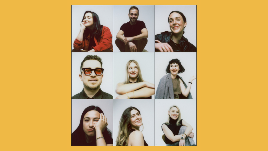
The majority female, queer-owned company was founded by chief creative officer Laura Petruccelli and chief strategy officer Graham North in 2022, before being joined by president Tamera Geddes in 2023. The team is now nine-strong across two offices in New York and LA, bringing together talent with experience from Goodby Silverstein & Partners, Droga5, JOAN and elsewhere.
Proud of, and guided by, the two values in its name, the agency puts its personality into its bespoke, hero creative process, called ‘FrankShop’, giving clients a unique experience that they’ve responded well to. Describing it as a “hero version of normalising honesty”, which keeps clients, creatives and other partners aligned upfront, Graham explains:
“It's essentially a six week process for strategic and creative that leads up to two days in a room together with no phones, hashing it out with the client’s leadership to have more uncomfortably honest conversations than they're used to having. It’s often referred to as ‘brand therapy’. But really, the point is to hold space to make the trade-offs that leadership doesn't normally make.”
Yes, CMOs have cried, reveals Laura - but thankfully this is due to the “ridiculous levels of unlock” that come from solving tension between teams and in the work during FrankShops.
Graham believes that “being nicer and franker” is something that the industry as a whole aspires to be. However, a lot of small, historically toxic elements of the creative process have simply become muscle memory for agencies. “They’re notoriously bad at using their creative superpowers to challenge themselves. We joke that we go psychotically specific in the way we identify those small things and try to change them.”
Through every design choice, the FrankShop process aims to make clients comfortable with articulating their honest truth, revealing insightful nuggets and conversations that can be built on by nice&frank’s creatives and strategists, who split the team 50-50. Even if it’s through “dumb games” like ‘pin the tone on the donkey’, Graham explains that it normalises clients venting and saying uncomfortable truths - “early and often” - to identify where the friction to honesty lives in a brand. “The result is, the work’s more honest.”
“The other part is the ‘nice’ element,” adds Laura. “Making it playful, memorable and fun… having catchphrases, using emojis to vote on work – it just makes clients feel like they're in a room they've never been in before, and coming out with work that they haven't thought of before. It’s honesty, not just in the way we work, but in how the work shows up on the other side.”
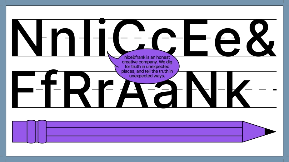
After an 18-month journey of curating this process at nice&frank, the team has decided to refresh the company’s own look, making this philosophy visible through a cohesive design system that ties everything together with a suitably playful, childlike simplicity.
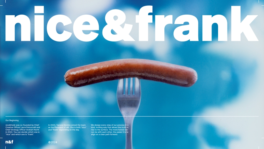
Behind the new visuals are nice&frank’s own associate creative directors, Nicole LeLacheur and Erica Stevens, as well as ex-Grand Army creative directors, Michael Stone and Ben Gallegos. Inspired by old elementary school workbooks, the designs include illustrations and a series of charming hot dog icons that help give clients and creatives alike ‘permission to play’ during the FrankShop process.
“It’s a fully fleshed-out design system that really blurs those two ‘nice’ and ‘frank’ philosophies together,” says Nicole. “It really does feel like everyone comes back down to sitting at the kindergarten rug again. Everyone gets to have an opinion and something to contribute.”
She continues, “FrankShop, at its core, is [about] truly coming together, very much like a workshop or classroom vibe. Everyone's sitting at the same table, there's paper, workbooks, colours… extremely visual, fun exercises. That’s a great jumping-off point to go back to a more foundational, slightly elementary look and feel that’s just fun. Like when you're a kid and you open up a carton of crayons for the first time. It feels like we're actually not taking ourselves too seriously - like what creativity should feel like, which is fun and exciting and visceral.”
“So many of us really haven't tapped into this since we were a kid,” adds Erica, “where we felt uninhibited, where we were honest, and we didn't overthink everything. That freedom allows the people we work with to work in this unique way and lean into the process.”
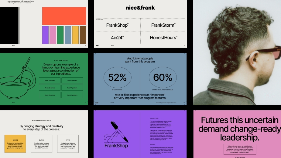
The colours chosen for the new visuals were inspired by crayons, and hand-drawn, doodle-like images and characters accompany the scholastic workbook stylings that appear in everything from nice&frank’s site to to its decks.
As well as matching the spirit of FrankShop, this also helps the agency stand out from other independent newcomers with a different tone, and occupy a different visual space to the more minimalistic, systemic designs of larger agencies and creative networks.
“You'll see clusters of the indie shops wanting to feel very gritty, ‘cool kid’ and urban. Honestly, that's just not us,” says Nicole. “That’s not to say we don't think we're cool – we're just very much in more of an authentic, relatable space. We should be the most fun meeting in our clients’ day… When we pull up a deck on a screen, we want it to feel like a breath of fresh air and fun, with colour and big type.”
“We're not too interested in feeling like editorial fashion or anything like that,” she adds. “It goes back to our FrankShop model and making our clients feel like they can just talk to us like humans, like children, and say the thing that maybe they’re thinking but don't want to say.”
And this approach clearly attracts people, as nice&frank’s client list now includes Ruffles, Lay’s, Tostitos, Les Mills, the San Francisco Giants and more, all awarded without needing to pitch. But don’t let the childish, imaginative designs fool you - the ‘nice’ imagery goes hand-in-hand with some ‘frank’ messaging.
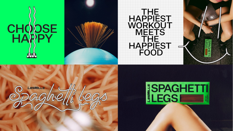
Above: nice&frank's work for Les Mills
“Even though there is a childlike approachability to the design system,” explains Graham, “the language is very much like: ‘[your] alignment’s fucked, it's ruining your brand, and if you can't get on the same page as to who you are, you're never going to get to a space of brave creative work’. That gut punch, which so many CMOs especially are feeling, is packaged nicely, but it's actually a hard-hitting message. I think that juxtaposition is what works for people.”
Bold colours, sparing and easily understandable copy, and not over-designing the new visuals has helped package these uncomfortable conversations in a way that feels disarming. “You kind of can't feel negative thoughts when you're seeing something against a really bold, neon purple,” adds Nicole. “The dichotomy between those two things really works.”
“Colour was actually a really interesting one to play with,” says Erica. “We wanted to stand out - and the instinct is to have a smaller series of colours that you always stick to - but it didn’t align with this idea of play, expressionism and openness. So we really opened that colour palette up to this ‘crayon’ mentality where we have a lot to play with.”
Being able to package these uncomfortable moments nicely, and “Trojan Horse” the strategy further up stream, says Graham, is helping nice&frank alleviate some of the issues which he believes are “crippling” marketing departments and brands across the industry today.
Whether it’s traditional launch films, experiential activations or building new design systems for the likes of Stanford Medicine, he says that the creative output from nice&frank’s approach, embodied by the newly revamped visuals, actually ends up solving the brands’ problems, and empowers the CMOs they work with to be braver.
“The design system helps [with this],” adds Laura. “Everything is to help put the clients in the position where they're ready to step forward into making some braver work, or do something bigger. It does a good job of taking you through the narrative of strategy, so the clients are nodding, nodding, nodding, and then they’re way more likely to say yes to the big idea.”
“That's where I'm really proud of the way our agency is balanced between creative, strategy and craft now,” she concludes, “with a design that helps do the whole job, basically walking the clients to water.”